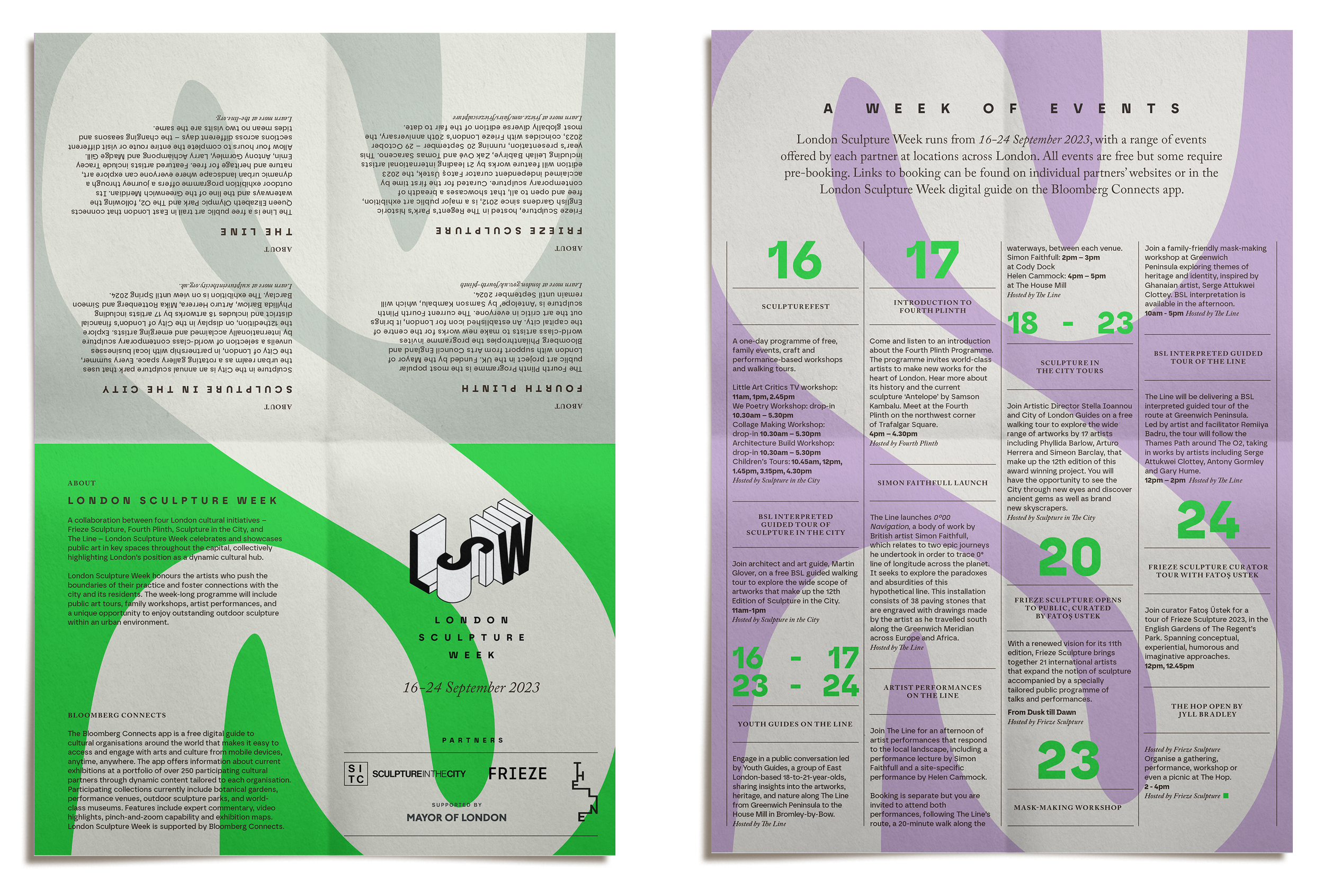
A new visual identity was created to launch London Sculpture Week, designed to engage a wide audience and make art accessible to all. The system balances sophistication and playfulness, pairing a classic black-and-white foundation with vibrant colours, bold shapes, and a mix of modern and traditional typography.
The logo captures the dimensionality of sculpture in a refined 3D form. While consistent in its structure, its adaptable colour system allows it to integrate seamlessly across applications and sit comfortably alongside partner brands.